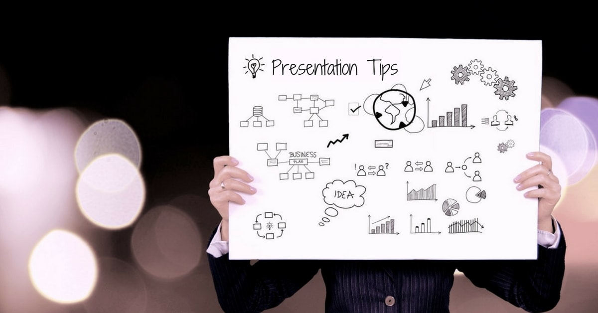
Presentations have been an integral part of business culture. And in recent years, Slideshare has become the go to resource, especially for B2B professionals, to engage their audience, get more exposure, and even generate high-quality leads.
While it’s fairly easy to learn the ins and outs of how Powerpoint or Slideshare works, creating compelling presentations requires thoughtfulness and creativity.
As attention spans continue to drop, it has only become harder to get people to stay and consume your message. That’s why it’s important to be familiar with principles of an effective presentation, and not just the technical aspects of presentation making.
With sites like Slideshare getting 70 million visitors every month, a well-done presentation can go a long way in boosting your brand and establishing credibility.
So to better understand how to design presentations that work, we decided to take a look at the most viewed presentations on Slideshare. Over 400k slideshows are uploaded every month, but only a few make it to the front page of Slideshare.
After analyzing hundreds of presentations, here are our best tips on increasing the chances that your audience will like and engage with your presentation.
Hook Users With Your Title Slide
As prospects are going through different presentations on Slideshare, your title slide should be such that it instantly stops them in their tracks. It should grab your attention and make you want to see more.
Here’s a presentation with a great title slide, for example.

Make sure to never use a dull, plain-text title slide. You can icons or illustrations for a powerful effect and make a statement with your slide.
Maintain A Consistent Structure
A consistent layout in each slide helps with the flow of presentation: the same margins, the same font and size for each heading, the same color of body font in each slide. Here’s a presentation that gets it right.
Consistency helps create a solid presentation because the viewer can immediately understand the cues and follow along the slides. And whatever you can do to make your presentation easy to read and understand, the better.
Think Outside The Box
I found a link to this presentation in an article I was reading. And when I clicked on it, I wasn’t expecting anything remarkable. Just a typical presentation, like I have seen countless other times.
But to say I was surprised will be an understatement. It’s one of the most unique slideshows I have ever seen. One click and the prospect is instantly sucked into the world of comic books.

Now I admit, going this far with your design is a risky bet. And this won’t work for every business. But if you can do anything to break from the traditional mold and create something different, it’s definitely worth doing.
Keep Mobile In Mind
People are consuming content on their cell phones and tablets more than ever. Hence, it is becoming increasingly vital to make your slide-decks render well on mobile devices.
The text in each slide should be large enough to be viewed on small screens. And there should not be too many tiny details in a slide.
Have Only One Graph Per Slide
When there’s too much going on in one slide, it’s easy for the audience to lose focus and get distracted. Many people have the habit of putting multiple graphs, tables or charts in a single slide.
The right way is to have just one focal point in each slide. In this presentation, for example, the author made sure that each slide focuses on a single thing. So it’s easy to understand the contents of the slide deck.
Spice Up The Background
Having a beautiful background scene, or adding some subtle icons, shapes or textures to the background of the slides in the presentation can make them more interesting and appealing to look at.
It works even better when you’re only showing one or two points per slide so the audience can absorb the idea and process it better with respect to the design. You can even take the colors up a notch to match the overall topic of slide deck.
Utilize Fonts Effectively
Too many different fonts are sure to clutter up your presentation, while using just one font throughout the presentation can also have a negative impact. So the ideal way is to strike a balance.

In this presentation, for example, Hubspot has used a few different fonts and used typography beautifully to make a statement in each slide.
By doing this, they have added the required emphasis to certain ideas, making it both engaging and easy to follow along for the audience.
Include Relevant Examples
If you are presenting a complicated idea to an audience, it’s good to have a ton of examples to explain and support your ideas. That’s not to say that you should go overboard with too many, but having more use cases is always better than having few.
Take a look at this presentation from With Company. About 20 slides are about great and inspirational prototyping. The examples don’t feel repetitive because they are all very informative and useful.
Follow The Rule Of Three
No matter what the layout of your slide, make sure that it doesn’t have more than 3 ideas, columns, points or other elements to make sense of.
This presentation is a great example of how the author makes sure that each slide doesn’t overwhelm the reader with too many things to look at.
Maintain Photo-Filter Consistency
This point ties right in with the previous one about maintaining brand consistency in your slides. Using different filters and color saturations for each photo can give an awkward feel to your presentation.
From layout to colors to the type of filter you have applied to your photos, all the slides should be similar in some aspects to help audience identify and remember your brand even long after the presentation.
Label Your Charts
When you don’t add any text or annotations to your charts and graphs, it becomes almost impossible to figure them out when you’re not there to present it.
This is especially true for presentations shared on sites like Slideshare. Here’s an example of a presentation that gets it right.

If you can combine the elements of the graph with descriptive text, your presentation will be able to paint a picture which the audience can easily comprehend.
So make sure you create your presentation in such a way that it can be understood even in your absence.
Clarify Next Steps
The worst thing you can do at the end of your presentation is to just end it with a thank you. Don’t leave your audience handing with no idea on what they can do next.
Use a call to action or next steps slide to direct them towards an objective. May be you want them to look at more of your presentations, sign up to your newsletter or connect with you on social media.
Tell them what they can do if they want to learn more. Push them towards action.
Use White Font On Beautiful Backgrounds
There is a reason so many successful presentations use beautiful white fonts on top of an image. It just looks elegant and the text is easy to read on any image.

Take a look at how this presentation uses white typography on so many different images with different fonts. And tell me if that doesn’t just look awesome!
Quote An Influencer
Adding quotes from brands or influencers your audience knows and trusts lends credibility to your presentation. And it doesn’t just have to be a quote. It can be a collection of ideas, or a case study.
Take a look at this presentation by Robert Katai for instance, which includes a quote by Gary Vaynerchuk. Not only does it make the presentation more engaging, but also helps in building a good relationship with influencers.
Summarize Your Main Points
Summarizing your main points is a must, especially if your presentation has covered a lot of information.
A summary slide also helps the audience see the big picture of your presentation and figure out how the various parts fit together.
Plus, many people prefer to have a takeaways slide in the end which they can refer to again without having to go through the entire slide-deck.
Combine Text With Icons
Having your main points just floating out in the form of plain text with nothing to hang onto is not a professional look. Give your points something to hang onto. This something will be anchor icons.

Check this presentation for great examples of icons used in slides. Icons help the audience connect ideas with graphics so they can understand the retain the information better.
Conclusion
There you go. I hope you found these ideas useful and would refer to them when creating your next slide deck.
With a few tweaks and bit a bit of patience, I am sure you’ll become a presentation ninja in no time. And you’ll be able to design presentations that engage your audience and go viral on Slideshare. So get started!

